
How to Design Signs and Large Format Graphics that Get Results
Signage is one of the most effective marketing tools that a business can use to reach their target audience. But what makes for good signage design? In this blog post, we will explore the key elements of effective signage design.
Designing signs and large format graphics that are effective can be a challenge. But by following some simple principles, you can create signage that is eye-catching and informative, and that gets results.
Some of the key elements of good signage design include the use of color, typography, and images. The layout is also important, as is creating a call to action.
By following these tips, you can design signs and large format graphics that are effective and that get results.
Defining Your Objective
Before you even start designing your sign or large format graphic, it’s important to define your objective.
- What do you want your sign to achieve?
- Are you promoting a sale or a new product?
- Do you want to encourage people to visit your store or website?
- Do you want to increase brand awareness?
Once you know your objective, you can design your sign with that goal in mind. It’s important to keep your message clear and concise. Signs that are cluttered with too much information can be overwhelming and ineffective. Choose one or two key messages and make them prominent on your sign. Use bold headlines or striking imagery to grab people’s attention and draw them in. Ultimately, the success of your sign will be measured by the results it achieves. If your sign is promoting a sale, track your sales during the promotion period to see if there was an increase. If your sign is encouraging people to visit your website, track your website traffic during the time the sign is displayed. This will allow you to see if your sign is achieving your objectives.


Knowing Your Audience
Knowing your audience is crucial in any form of marketing, including sign design.
- Who are you trying to reach with your sign?
- What are their interests, needs, and concerns?
This information can help you design a sign that will resonate with your target audience. Consider the demographics of your audience, such as their age, gender, and income. This can influence the style of your sign and the language you use. If you’re targeting a younger demographic, for example, you may want to use a more playful font and brightly colored imagery. It’s also important to consider the location of your sign. Will it be displayed inside a store or outside on a busy street? The location will impact the design of your sign and the type of message you should include. For example, a sign displayed on a busy street should have a clear and concise message that can be read quickly by people passing by.
Taking the Location into Consideration
As mentioned earlier, the location of your sign is an important factor to consider when designing it. The location will determine the size and design of your sign, as well as the type of message you should convey. If your sign will be displayed outside, you need to take into account the weather conditions. Will your sign be exposed to the sun or rain? If so, you’ll need to choose materials that can withstand these conditions. You may also need to choose larger lettering or more prominent colors to make your sign visible from a greater distance. If your sign will be displayed inside, you may have more freedom to choose different materials and designs. However, you still need to consider the location within the building. Is it in a high-traffic area or tucked away in a corner? This will affect how visible your sign is and how much attention it will receive.
Making it Easily Readable
One of the most important aspects of any sign is readability. Your message needs to be clear and easy to read for your sign to be effective. This means choosing the right font, size, and spacing to ensure that your message is easily legible. When choosing a font, choose something simple and easy to read. Avoid overly decorative fonts that may be difficult to read, especially from a distance. The size of your font will depend on the size of your sign and the location it will be displayed. Larger signs will need larger lettering to ensure they are easily visible. The spacing between your letters and words is also important. Too little spacing can make your message appear cluttered, while too much spacing can make it difficult to read. Once you’ve chosen your font and size, play around with the spacing until your message is easily legible.
Incorporating Appropriate Imagery
Imagery can be a powerful tool on a sign or large format graphic. It can help to grab people’s attention and convey a message more engagingly. However, it’s important to choose the right imagery for your sign and your audience. Consider what type of imagery will resonate with your target audience. Will they respond better to photographs or illustrations? Should the imagery be playful and fun or more serious and professional? The imagery you choose should complement the message you are trying to convey and be appropriate for the product or service you are promoting. Remember that less is often more when it comes to imagery. You don’t want to overcrowd your sign with too many images, as this can make it appear cluttered and difficult to read. Choose one or two key images that will help convey your message and make them prominent on your sign.

Use Attractive Colors
Finally, the use of color is another important factor in good signage design. Color can help to create an emotional response in people and can make your sign more eye-catching and memorable. Choose colors that complement your brand and the message you are trying to convey. Bright colors can help to grab people’s attention, while more muted colors can convey a more sophisticated message. It’s important to choose colors that are legible from a distance, especially if your sign will be displayed outside. Remember to use contrasting colors to make your message more visible. For example, white writing on a dark background can be easier to read than black writing on a white background. Play around with color combinations until you find something that is visually appealing and easy to read.
Conclusion
Designing signs and large format graphics that get results requires careful consideration of your objectives, your audience, the location, readability, imagery, and color. By following these principles, you can create effective signage that is eye-catching and informative. Remember to measure the success of your signage by tracking results and making adjustments where necessary. With the right design, your signs and large format graphics can help to boost sales and increase brand awareness.
Let Us Help You with Your Sign Project
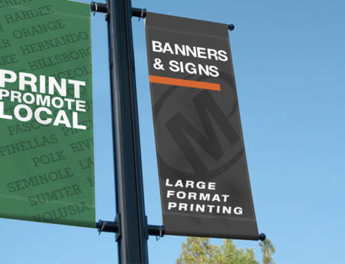
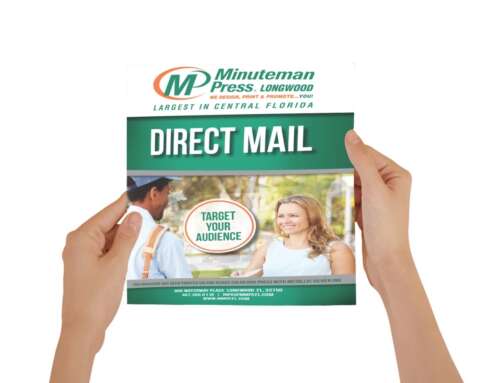
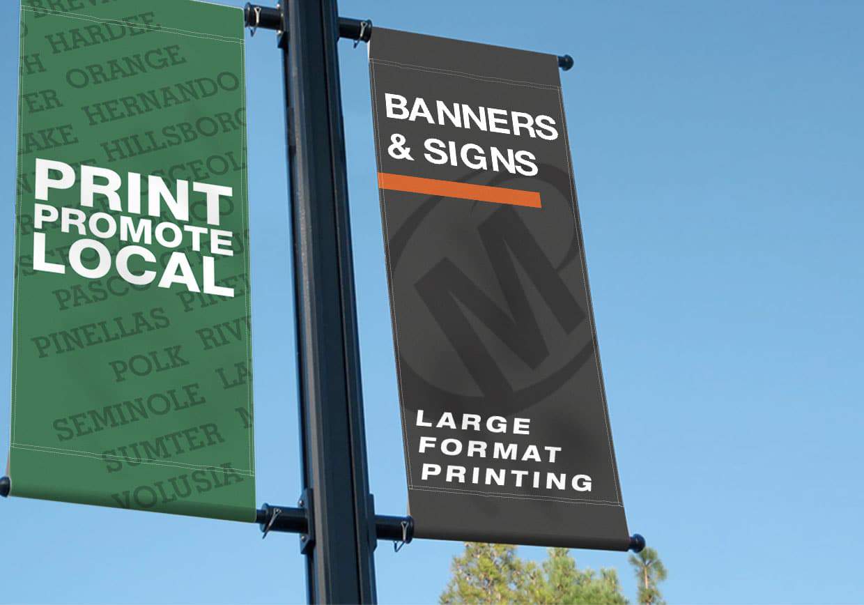
Locally owned and operated, Minuteman Press Longwood provides high quality large format design and printing services to storefront businesses, non-profit organizations, and individuals in the Central Florida area
As a business owner, you have many responsibilities. You need to make your presence known, but you probably don’t have the time or resources to create eye-catching graphics and signs that will help drive your bottom line. Luckily, Minuteman Press Longwood has you covered. We specialize in designing and printing high quality signs and large format graphics at an affordable price. Our team of experts can help create:
We have the equipment, expertise and skills to help build your image, promote your message, and boost your sales.
Contact one of our friendly customer service representatives to get your sign or large format project started TODAY!
or call:
407-260-0116


