5 Tips for creating a timeless logo
A company’s first logo design is hardly ever its last. The progression of design is reliant upon skepticism. Frustrating? Of course. Rewarding? Ultimately, yes.
Designing a logo is as daunting as writing a cover letter for a new job. The only difference is that instead of having an entire page to describe yourself, you have one image to capture who you are as an entire company. A brand logo not only has to speak for your company’s identity, but the value your company provides.
How can you make sure your brand logo is fulfilling its strategic and emotional purpose?
Here are 5 things to keep in mind when designing a brand logo:
-
Know your purpose and your audience’s purpose.
What does your company offer? Your logo should spark your target audience’s interests and their desire to buy into your brand. A brand logo should communicate your brand in the same way words do. How can you make sure people are “reading” your logo correctly? By offering a clear stance on your services.
Consider The Swag logo. The Swag is a company that makes reusable containers for produce that are not only natural but extend the freshness of groceries. The font of the logo is inviting and simple, much like natural products are designed to be. The illustrated vegetables suggest the purpose of the Swag bag being for those who live a healthy lifestyle, those who grocery shop, and those who cook.
The Paint Manager, a residential painting company, created their logo to be reminiscent of a professional painter’s pallet. The multi-colors of the pallet are easily identifiable with The Paint Manager’s painting services and creative liberties.
-
Know who you’re designing for.
Who benefits from your brand? Who is your demographic? When you know who you want to reach, make a design that will appeal to them.
- The Disney logo does this well—the Cinderella castle is outlined behind their text, evoking childlike happiness, imagination, and fond memories of Disney in every capacity.
- Nike’s logo is shaped like a feeling, an experience. It elicits the “swoosh” factor of speed and athleticism.
- Physicians Weight Loss’slogo represents the feeling of meeting a goal. They execute this by having an indistinguishable person, making it clear that their patients can be either men or women, as the main figure. However, around the figure’s white silhouette is a wider green silhouette. This shows the progress of weight loss to a happier self as indicated by the victorious up-reach of the arms. The green in the logo represents growth in their journey partnered with Physicians Weight Loss.
- Tostitos uses their brand logo to suggest what customers should use their products for—enjoying good food and good company. The brand successfully appeals to many audiences with the feeling of social interaction and fun- there aren’t that many people who don’t want to enjoy good food and good people!
-
Know your industry, SO be different.
Logos should always represent a direct correlation to your brand and your industry. In addition to your industry as a whole, a brand logo needs to serve as a contextual association between your company and what you offer to your consumers.
Consider Target’s famous bullseye logo. Not only is it recognizable without any supporting text, the bullseye represents how Target is different from other competing stores like Walmart and Kmart. The bullseye, like playing darts, suggests that no matter what you need, Target is your bullseye destination.
Amazon presents a similar idea with an arrow reaching from ‘a’ to ‘z’ in their name. Consumers naturally associate the arching arrow with a smile. While this is an appropriate interpretation, the stretch length of the arrow is just as important—consumers will find everything from “a to z” on Amazon.
-
Simplicity is adaptive.
Logos, as part of your branding, should be easily adaptable to fit any product, image, or content your company produces. With that said, simplicity is a great foundation for designing a brand logo.
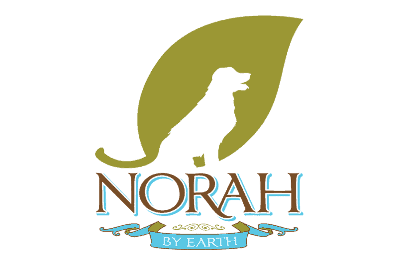
Norah by Earth, a naturally-derived shampoo for dogs with skin irritations, chose a very simple design for their product line. They created their formula for a Golden Retriever suffering from unrelenting hot spots. They used the silhouette of the Golden Retriever to tell their story of origin wrapped in a leaf that represents their philosophy of natural ingredients. The logo is small and simple enough to be placed on their bottles, branded images, and other merchandise. The image is also compact with the use of negative space created in the leaf. Simple, small, and effective!
-
Know how to stand the test of time.
A good brand logo is timeless. Successful logos like Coco-Cola and Mercedes both have changed very little over the past 100 years. Not only does a classic logo design defy the lifespan of expiring trends, it creates a familiarity with your company. Familiarity, as you know, evolves into brand trust. Brand trust is the foundation of customer loyalty. Without customer loyalty, your company doesn’t have a reliable source of continued prosperity.
Ask yourself:
Does your logo tell the story of who you are and what you represent?
Does your logo elicit an emotional response from your target consumer?
Does your logo stand apart from others in your industry?
Is your logo simple?
Does logo transcend evolving trends?
Our designers know how to make any brand come alive! Helping you create an identity is what we do. You have the company, let us help you brand it!
5 Tips for creating a timeless logo
A company’s first logo design is hardly ever its last. The progression of design is reliant upon skepticism. Frustrating? Of course. Rewarding? Ultimately, yes.
Designing a logo is as daunting as writing a cover letter for a new job. The only difference is that instead of having an entire page to describe yourself, you have one image to capture who you are as an entire company. A brand logo not only has to speak for your company’s identity, but the value your company provides.
How can you make sure your brand logo is fulfilling its strategic and emotional purpose?
Here are 5 things to keep in mind when designing a brand logo:
-
Know your purpose and your audience’s purpose.
What does your company offer? Your logo should spark your target audience’s interests and their desire to buy into your brand. A brand logo should communicate your brand in the same way words do. How can you make sure people are “reading” your logo correctly? By offering a clear stance on your services.
Consider The Swag logo. The Swag is a company that makes reusable containers for produce that are not only natural but extend the freshness of groceries. The font of the logo is inviting and simple, much like natural products are designed to be. The illustrated vegetables suggest the purpose of the Swag bag being for those who live a healthy lifestyle, those who grocery shop, and those who cook.
The Paint Manager, a residential painting company, created their logo to be reminiscent of a professional painter’s pallet. The multi-colors of the pallet are easily identifiable with The Paint Manager’s painting services and creative liberties.
-
Know who you’re designing for.
Who benefits from your brand? Who is your demographic? When you know who you want to reach, make a design that will appeal to them.
- The Disney logo does this well—the Cinderella castle is outlined behind their text, evoking childlike happiness, imagination, and fond memories of Disney in every capacity.
- Nike’s logo is shaped like a feeling, an experience. It elicits the “swoosh” factor of speed and athleticism.
- Physicians Weight Loss’s logo represents the feeling of meeting a goal. They execute this by having an indistinguishable person, making it clear that their patients can be either men or women, as the main figure. However, around the figure’s white silhouette is a wider green silhouette. This shows the progress of weight loss to a happier self as indicated by the victorious up-reach of the arms. The green in the logo represents growth in their journey partnered with Physicians Weight Loss.
- Tostitos uses their brand logo to suggest what customers should use their products for—enjoying good food and good company. The brand successfully appeals to many audiences with the feeling of social interaction and fun- there aren’t that many people who don’t want to enjoy good food and good people!
-
Know your industry, SO be different.
Logos should always represent a direct correlation to your brand and your industry. In addition to your industry as a whole, a brand logo needs to serve as a contextual association between your company and what you offer to your consumers.
Consider Target’s famous bullseye logo. Not only is it recognizable without any supporting text, the bullseye represents how Target is different from other competing stores like Walmart and Kmart. The bullseye, like playing darts, suggests that no matter what you need, Target is your bullseye destination.
Amazon presents a similar idea with an arrow reaching from ‘a’ to ‘z’ in their name. Consumers naturally associate the arching arrow with a smile. While this is an appropriate interpretation, the stretch length of the arrow is just as important—consumers will find everything from “a to z” on Amazon.
-
Simplicity is adaptive.
Logos, as part of your branding, should be easily adaptable to fit any product, image, or content your company produces. With that said, simplicity is a great foundation for designing a brand logo.
Norah by Earth, a naturally-derived shampoo for dogs with skin irritations, chose a very simple design for their product line. They created their formula for a Golden Retriever suffering from unrelenting hot spots. They used the silhouette of the Golden Retriever to tell their story of origin wrapped in a leaf that represents their philosophy of natural ingredients. The logo is small and simple enough to be placed on their bottles, branded images, and other merchandise. The image is also compact with the use of negative space created in the leaf. Simple, small, and effective!
-
Know how to stand the test of time.
A good brand logo is timeless. Successful logos like Coca-Cola and Mercedes both have changed very little over the past 100 years. Not only does a classic logo design defy the lifespan of expiring trends, it creates a familiarity with your company. Familiarity, as you know, evolves into brand trust. Brand trust is the foundation of customer loyalty. Without customer loyalty, your company doesn’t have a reliable source of continued prosperity.
Ask yourself:
Does your logo tell the story of who you are and what you represent?
Does your logo elicit an emotional response from your target consumer?
Does your logo stand apart from others in your industry?
Is your logo simple?
Does logo transcend evolving trends?
Our designers know how to make any brand come alive! Helping you create an identity is what we do. You have the company, let us help you brand it!


