Ribshack Re-Branding
Ribshack foods offer different BBQ sauces that take smokey deliciousness to the next level!
The Challenge
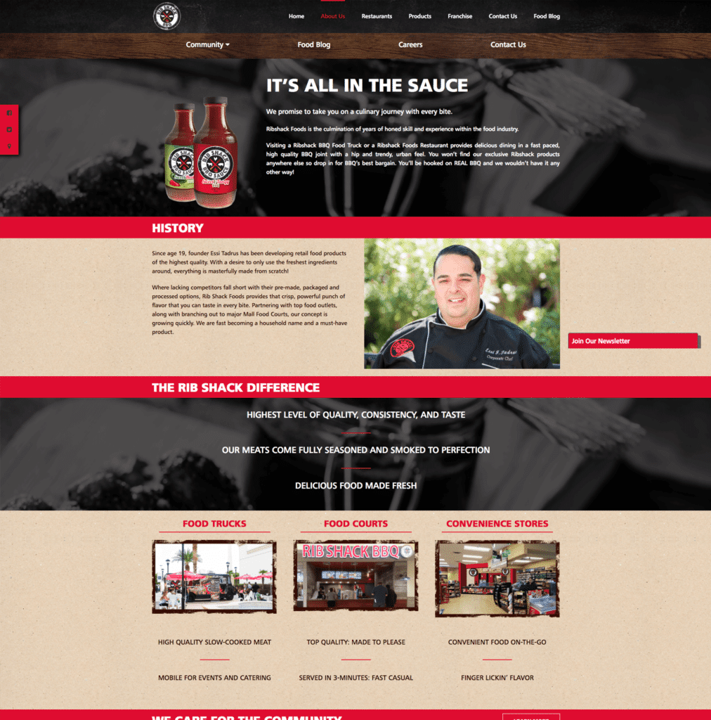
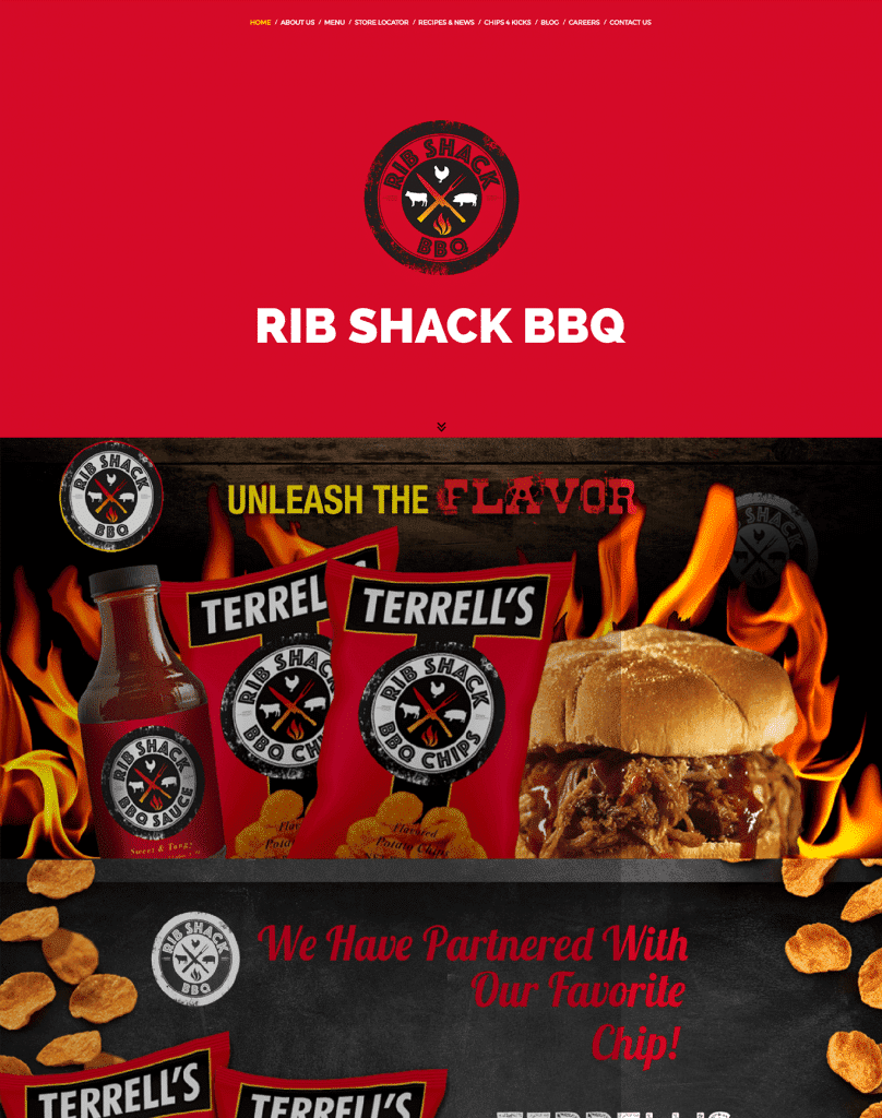
When they first created their web presence the Ribshack Food Group focused on highlighting their popular food items on their website. They felt that their existing site gave their visitors very little insight into the company, and it was no longer a good representation of how the company had grown. The Ribshack Food Group wanted to create a more meaningful website that described how their business had grown.
Upon entering the website, users were greeted with stunning animated banners that showcased their cuisine with highlighted text. Although this was visually appealing, it did not give any give the users the ability to learn more about their expanded menus. And it showed them the food but said nothing of the story and team behind it, and it did not have a clear call to action.
Solution: Brand Transformation
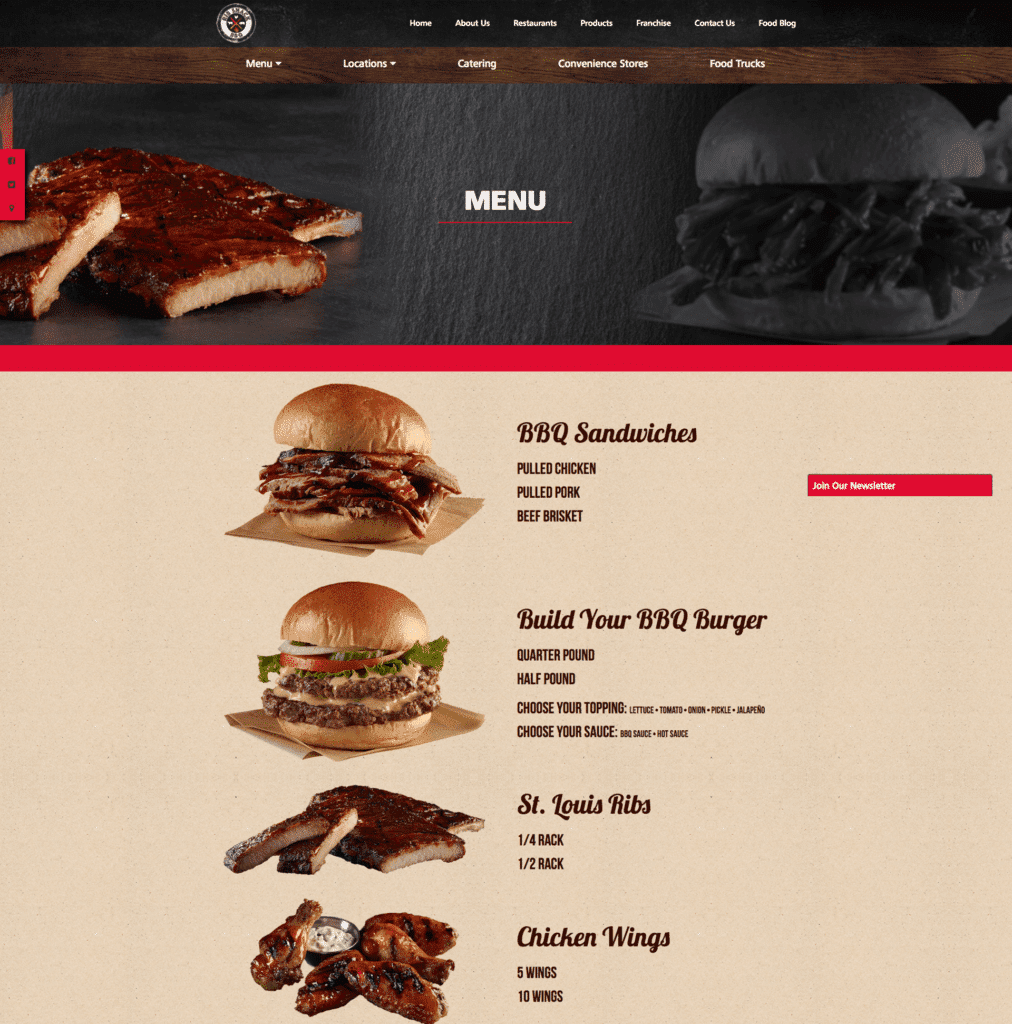
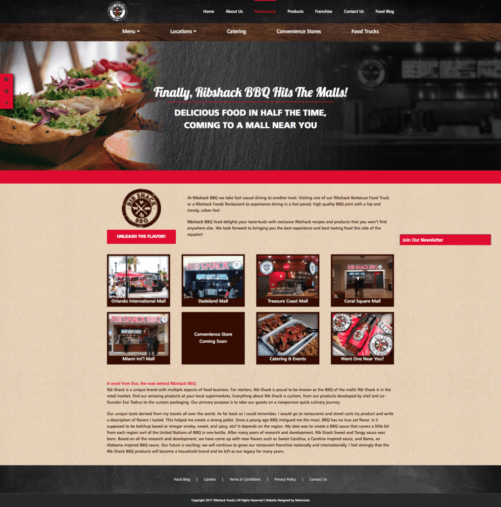
To enhance the Ribshack website we needed to create additional pages that would not only highlight the company’s many menu items, but also show just how many services they provided to customers. Another goal of the new website was to create separate areas of interest for their many target audiences (being restaurant customers, franchisees, and companies interested in their products). We partenered with them to:
- Create an easy to navigate responsive website.
- Create a site that highlights all areas of services as well as products.
- Create a website that focuses on their 3 main target audiences
- Add more meaningful content and context to their mission.
- Create consistency in all their imagery to align with their new branding direction.
- Integrate social media experience, sharing, and channels within the website.
This project would be especially challenging in trying to combine three completely different targets in one location in a way that was still simple to navigate.
Results
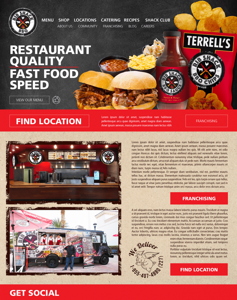
Minuteman Digital Agency created a successful space for all target audiences to learn more about the company. The restaurant website boasted beautiful banners, custom imagery, high definition photography, and structured content for all its visitors to enjoy. The new website increased the company’s web presence within the first week and was a great marketing tool to have for their presence at the International Franchise Expo.
More Examples
